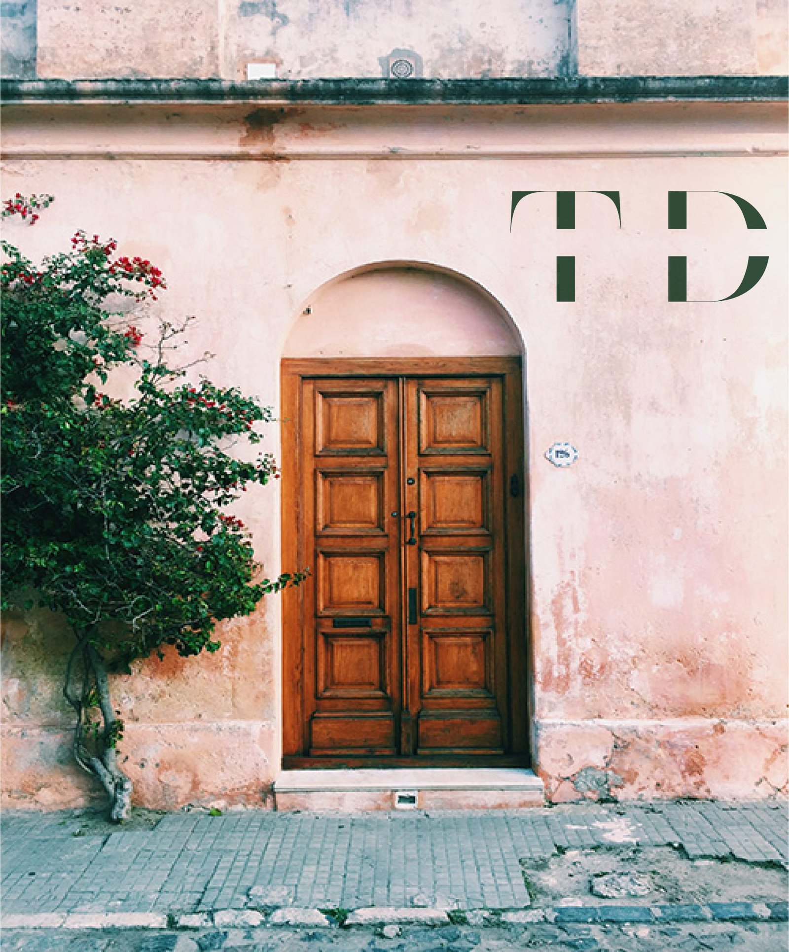
Tanya Dorman Designs
What We Did
THE CLIENT
Tanya approached me about helping her bring her dream to life- that is her dream of marketing herself for something that she had already been doing for years, an interior designer.
She said she wanted something worth of Vogue and Architectural Digest. I set out to make that aspiration a visual reality by simultaneously combining contemporary modern aesthetics with feelings of old world luxury. I wanted something that felt like it was reaching back into the past to create something for the future.
And she wanted something that represented her method of historical design, which pulled from her clients' histories, cultures, and family heirlooms.


THE PROCESS
Working with Tanya was equal parts curation and containment. Her creativity was explosive, ideas flying faster than we could sketch them but within that chaos was brilliance. My process was to slow the current just enough to capture its clarity and distill her design philosophy into its emotional and visual DNA of heritage, intimacy, and refinement. From there, I built a palette and typographic system that balanced architectural precision with romantic restraint, echoing the tactile richness of antique materials while maintaining a clean, editorial tone.
Each element, color, layout, pattern, and texture was chosen to mirror her process of uncovering beauty through lineage. The result was a brand that feels timeless yet current, one that could stand effortlessly between Vogue and Architectural Digest while remaining unmistakably hers.
THE WORK
Through dozens of conversations, moodboards, and visual experiments, we filtered her instincts down to their essence: sophisticated, soulful, and unapologetically eclectic. The design work itself became an act of translation, turning Tanya’s kinetic imagination into something structured, tactile, and timeless.
I experimented with palettes that nodded to patina and parchment, juxtaposed with clean, modern lines to keep the work grounded. Every logo variation, font pairing, and texture choice was deliberate, capturing her duality: the historian and the visionary.
From there, I built a brand system that framed her wild energy in elegance with layered typography, subtle tones that reflected her warmth, and textures that whispered legacy without feeling aged. What emerged wasn’t just a brand mark but a visual language that could hold her energy without taming it, sophisticated enough for the most discerning eye yet distinctly, unmistakably Tanya.


